Wilderness Boarding School
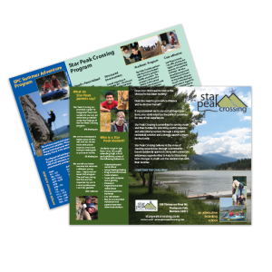
I love logo work. Particularly when working with a client that understands and appreciates the time and nuance required, as Star Peak did. Several iterations were presented with them settling on both a black and white and color version...one simple, the other more studied. There's also a vertical version for applications when the standard horizontal format wouldn't serve as a best choice. I also designed Star Peak's brochure.
- client: Star Peak Crossing
