Ahoy Crane! |Fundraising Event
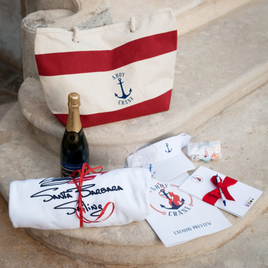
It's a lot of fun to play with a very specific color palette...in this case nautical blue and red and white. Everything designed used these three colors...and there were quite a number of items! Speaking of marketing a brand with many products: When first meeting with a client I ask: how many different ways do you imagine using your logo? It helps them to envision why it's important to think minimal and keep it clear. Later whether the client asks for a 2" sticker or a 60" banner...the final product works perfectly. With every invitation and theme, I am working alongside someone at the helm, if you will. Jen, the chair for this particular event, had a very strong sense of aesthetic and was always clear on what worked for her and what didn't. Of course, it's my job to provide direction and I really enjoy envisioning what my clients are looking for. But it's also a pleasure to work when the navigation is clear. Ba dum tish.
Items designed and produced include:• Seven-piece invitation
• Custom printed canvas bag
• Visor
• Wine glass
• Note pad
• Sticker
• Website page
• Tee Shirt
• Letterhead
• Banners
- client: crane country day school


